The Faux Calligraphy Header Formula I Use When My Weekly Spread Feels Flat (No Brush Pen Talent Required)

The Faux Calligraphy Header Formula I Use When My Weekly Spread Feels Flat (No Brush Pen Talent Required)
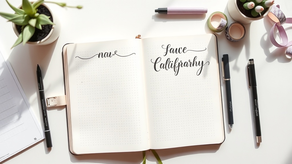
Okay okay okay if your headers keep looking wobbly and sad, this one is for you.
I love a good brush-pen moment, but the truth is I do not have the patience to practice pointed-pen calligraphy for an hour every night. Most weeks I need my planner setup done before my tea gets cold.
So this is the lettering technique I actually use in real life: faux calligraphy with regular pens. It gives you that thick-thin hand-lettered look without needing expensive tools or superhero hand control.
And yes, I tested this with the pens that live in my desk cup right now, including the cheap options.
The Technique in 3 Steps
If you can print in cursive-ish script, you can do this.
- Write your word normally in light pressure.
- Look at every downstroke (any line going downward).
- Add a second line beside each downstroke, then fill it in.
That is it. You are basically drawing your own "thick stroke" after the fact.
Strong opinion: this looks cleaner in a planner than true brush calligraphy when you are writing small headers like Mon, Errands, or Top 3.
The 15-Minute Practice Page I Give Beginners
When friends ask me where to start, I tell them to do one page with four mini drills:
- 3 minutes: draw vertical lines and thicken only the downstroke.
- 4 minutes: write the same word 8 times (
focusis a good one). - 4 minutes: do tiny headers only (
week,plan,notes,menu). - 4 minutes: write one real header you will use this week.
Do this once and your hand understands the rhythm.
Honest Pen Opinions (Including the Ones I Regret Buying)
I tested these specifically for faux calligraphy in planner headers, not big art pieces.
1) Tombow Fudenosuke Hard Tip (my favorite for control)
- Why I like it: clean edges, very predictable pressure, great for small lettering.
- What I do not love: feels scratchy on rough notebook paper.
- Typical price: around the low-to-mid $3 range for a single pen, often higher in boutique shops.
- My verdict: worth it if you letter weekly.
2) Pentel Sign Pen Brush Tip (best "easy mode" brush look)
- Why I like it: smoother feel and juicier line; forgiving for beginners.
- What I do not love: easier to over-thicken and make chunky letters.
- Typical price: around $2.93 to $3.45 per pen based on recent U.S. listings.
- My verdict: easiest starter if you want bouncy, softer headers.
3) Sakura Pigma Micron 05 (surprising faux-calligraphy MVP)
- Why I like it: precision. Your thickened downstrokes stay crisp.
- What I do not love: slower because you have to draw/fill every thick stroke manually.
- Typical price: usually cheapest in multipacks; single pens vary by store.
- My verdict: best if you want neat, compact headers over dramatic flair.
Budget Alternatives That Still Look Good
You do not need premium pens to make this work.
- Crayola Super Tips: excellent budget pick for larger headers; edge control is less crisp, but for weekly titles it works.
- Any smooth black gel pen + one gray marker: letter in black, add the faux thickness in gray for a shadow-style look.
- One-ballpoint emergency method: write lightly, thicken downstrokes slowly, then trace once. Not glamorous, still effective.
If your budget is tight, start with what you have and put money into paper later. Good paper improves lettering faster than buying your fifth brush pen.
The Biggest Mistakes I See (and How to Fix Them)
- Mistake: thickening upstrokes too.
- Fix: only thicken lines moving downward.
- Mistake: spacing letters too close, then filling blobs.
- Fix: add more breathing room than you think you need.
- Mistake: pressing hard on every stroke.
- Fix: keep the base word light, then add thickness intentionally.
My Real-World Setup for Sunday Planning
When I am setting up my week, this is my low-stress combo:
- Header word in Micron 05
- Thickened downstrokes with the same pen
- One Mildliner stripe behind the header for color coding
Time cost: about 20 extra seconds per header.
Visual payoff: my weekly spread looks deliberate, not "I wrote this half-awake in a meeting."
Concrete Takeaway: Do This Tonight
Before bed, open one scrap page and write next week five times.
- First two: normal handwriting.
- Next two: faux calligraphy (thicken downstrokes).
- Last one: faux calligraphy + one highlight stripe underneath.
Pick the version that feels easiest to repeat quickly. That is your planner lettering style for the next month.
Not the prettiest one on Pinterest. The one you will actually use.
Price note: I checked these ranges against current U.S. listings on March 13, 2026. Stationery pricing swings a lot, so verify before checkout.