The Artist Date Capture Page I Use When My Spreads Start Looking Same-Same

The Artist Date Capture Page I Use When My Spreads Start Looking Same-Same
If your weekly spreads all started to look like cousins, welcome to the club.
Mine get repetitive too. Same boxes, same headers, same three Mildliner colors on loop. When that happens, I do not buy more supplies first. I schedule an artist date, then I capture what I see with one simple planner page.
This is the exact method I use to bring my layouts back to life without turning my planner into a full-time craft project.
What I Mean by "Artist Date"
An artist date is one solo hour where your only job is to notice things.
Not "be productive."
Not "finish errands."
Not "optimize your life."
Just notice.
For me that might be:
- a museum wing with five paintings I would normally speed past
- a local bookstore table with chaotic-but-perfect cover palettes
- a neighborhood walk where I photograph hand-painted signs and old brick textures
- one cafe corner with my journal, a black pen, and no laptop
The point is to refill your visual brain.
Why This Works Better Than Pinterest Scroll Sessions
I love Pinterest. I live on Pinterest. But if I only consume polished planner photos, my pages start looking borrowed.
Real-world references force better choices:
- You notice weird color combinations that actually work.
- You catch texture details no template gives you.
- You collect lettering personality, not just "clean script font #14."
My strong opinion: inspiration is better when it has dust on it.
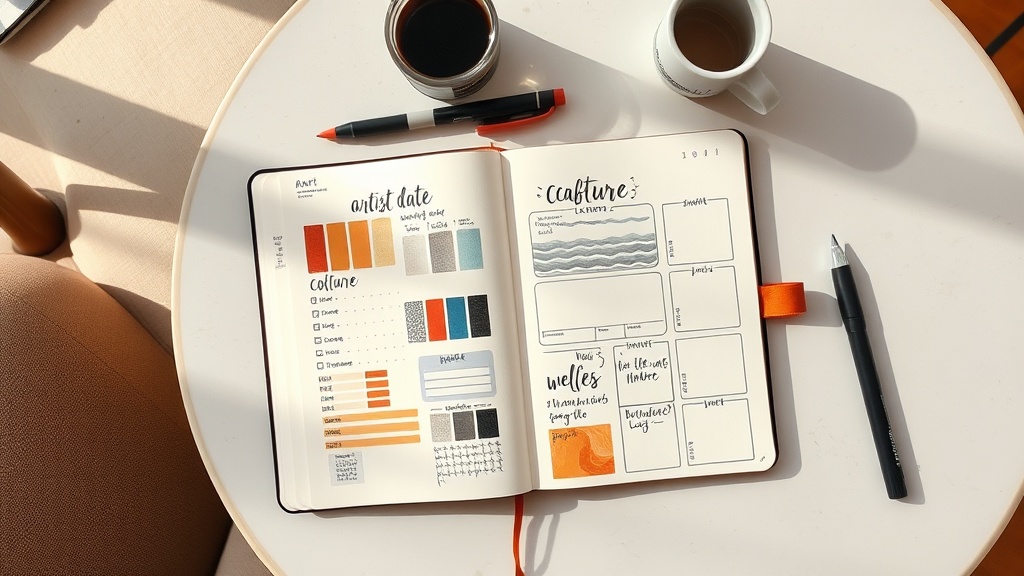
My One-Page Artist Date Capture Layout
I set this up on a single A5 page in about 8 minutes.
Section 1: Color Pull (top left)
Draw five small swatch boxes.
Label each with a plain-language name you will remember later, like:
- terracotta wall
- bus-stop teal
- espresso foam
- old poster red
- cloud gray
Do not label colors with perfect marker names unless you already own the exact pen. I learned that lesson after buying "close enough" shades I never touched again.
Section 2: Texture Notes (top right)
List three textures you saw and how to translate them to paper.
Example:
- cracked paint wall -> stippled dot border
- subway tile grid -> narrow boxed task columns
- woven cafe chair -> crosshatch tracker fill
This step is where "pretty things I saw" turns into usable spread mechanics.
Section 3: Lettering Grab (middle)
Pick one word from the day and test it in three quick styles.
I usually use words like "reset," "focus," or "gentle."
Rules:
- 30 seconds per style, max
- no erasing
- choose one and move on
Overthinking lettering is the fastest way to ruin a good planning session.
Section 4: Layout Translation (bottom)
Write these two prompts and answer them fast:
- "What will I actually use next week?"
- "What looks cute but is not functional for my real life?"
That second question saves me every single time. I love maximal collage pages, but during heavy project weeks I need clean task lanes and visible priorities.
My 60-Minute Artist Date Rhythm
Here is the exact timing I follow:
- 10 minutes: travel + settle
- 25 minutes: observe and collect (photos, notes, tiny sketches)
- 15 minutes: fill Artist Date Capture page
- 10 minutes: pick one idea to deploy in next week's spread
If I skip the last 10 minutes, inspiration stays theoretical. The close-out decision is non-negotiable.
Supplies (Budget + Favorite)
You can do this with almost anything.
Budget kit (under $10 if you already own a notebook):
- black gel pen
- one gray marker
- one accent color
- phone camera for references
My current favorite kit:
- Leuchtturm1917 A5 dotted notebook
- Sakura Pigma Micron 03
- Zebra Mildliner (Cool Gray + one seasonal accent)
- Tombow Fudenosuke (hard tip) for quick headers
Supply truth: this method works because of observation, not because of premium pens.
Common Mistakes I See (and Have Made)
- Turning the artist date into shopping
- Copying one creator too closely
- Capturing twenty ideas and using zero
- Making a gorgeous page you never reference again
Fix: before you close the journal, circle one color decision and one layout decision for next week. Done means usable.
A Real Example from My Last Artist Date
I visited a small gallery room, then sat outside with cafecito and did my capture page.
I pulled:
- warm clay + dusty blue as my weekly palette
- a repeating arch shape for habit tracker headers
- a hand-painted sign style for my "Top 3" box title
Next week's spread looked fresh, but still functioned like my normal system. That is the sweet spot.
Try This This Weekend
Put one solo hour on your calendar labeled "Artist Date."
Bring one pen. Maybe two if you are feeling wild.
Make the page messy.
Then borrow exactly one idea into your next spread.
If you do this, tag me at @artsyagenda. I want to see your color pulls, especially the unexpected ones.
Your planner should feel alive, not factory-produced.