Selecting the Perfect Paper for Your Mixed Media Experiments

Do you ever feel like your beautiful inkwork is being betrayed by the very surface you're working on?
There's nothing quite as frustrating as spending hours refining a delicate watercolor wash only to watch it pill, feather, or warp under your brush. It isn't just a minor annoyance; it's a fundamental disconnect between your intent and the physical reality of your art. Understanding the relationship between your medium and your substrate—the paper—is the difference between a finished piece that looks professional and one that feels amateurish. This post breaks down the technical properties of different papers so you can choose a surface that supports your creative vision instead of fighting against it.
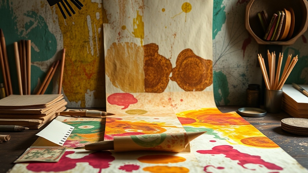
When we talk about paper in the context of visual arts, we aren't just talking about weight or thickness. We're talking about texture, tooth, absorbency, and pH levels. If you're working with heavy gouache, you need a different surface than if you're doing light graphite sketching. Choosing the wrong paper can lead to a loss of detail or, even worse, a permanent distortion of your artwork. Let's look at how to match your tools to your surface.
What is the difference between cold press and hot press paper?
This is perhaps the most frequent question I see from artists transitioning into watercolor or mixed media. The distinction lies entirely in the texture, often referred to as the "tooth" of the paper. If you've ever felt a surface that is slightly bumpy or rugged, you've encountered a cold press surface.
- Cold Press: This paper has a noticeable texture. It's a favorite for many because it catches pigment beautifully and provides a lovely, organic feel to the finished work. It's great for layering, but be aware that fine details might get lost in the bumps.
- Hot Press: This surface is smooth, almost glass-like. It’s fantastic for detailed illustrations, botanical studies, or any work where you want precise, sharp lines. However, it can be a bit more temperamental with heavy water loads, as the water tends to sit on top rather than soak in.
I often find myself reaching for cold press when I want my art to feel more expressive and tactile, but for my structured, detail-heavy journaling, I switch to hot press. It's a matter of intention.
How much weight does my paper actually need?
In the world of paper, weight is measured in grams per square meter (gsm) or pounds (lb). If you're only using a pencil or a fine-liner, a standard 80gsm sketchbook is plenty. But the moment you introduce water, everything changes. If your paper is too light, it will buckle and curve, making it nearly impossible to maintain a flat plane for your art.
For watercolor or heavy ink work, I recommend staying above 300gsm (roughly 140lb). At this weight, the paper can handle the moisture without warping excessively. If you're doing a lot of "wet-on-wet" techniques, you might even want to look into 640gsm paper, which is incredibly thick and almost feels like a board. For more technical information on paper density and its effects on pigment, you can check out the resources at Winsor & Newton, which provides deep dives into medium-specific requirements.
| Medium Type | Recommended Weight (gsm) | Preferred Texture |
|---|---|---|
| Graphite/Colored Pencil | 90 - 150 | Smooth/Hot Press |
| Ink/Fineliners | 120 - 200 | Smooth/Slightly Textured |
| Watercolor | 300+ | Cold Press/Rough |
| Gouache/Acrylic | 300+ | Cold Press/Medium Grain |
Why does pH level matter for my artwork?
This is a concept that many artists overlook until it's too late. "Acid-free" is a term you'll see everywhere, and it's not just marketing jargon. If your paper has a low pH (meaning it's acidic), it will yellow and become brittle over time. This is especially true for your favorite sketches that you want to keep for years.
When you're selecting high-quality art paper, always look for the "acid-free" or "pH neutral" label. This ensures that the lignin in the paper won't break down and destroy your work. If you're using archival-quality pens or paints, it's a shame to use them on paper that will eventually turn a sickly yellow-brown. It's an investment in the longevity of your creative practice. For more on archival standards, the Museum of Modern Art often features discussions on preservation and the materials used in fine art.
The way you approach your materials should be as intentional as the way you approach your color palettes. Whether you're a professional artist or someone who just loves a beautiful, textured journal page, knowing your substrate is a game-changer. Don't settle for whatever paper is lying around; find the one that invites your medium to play.
Think about the tactile experience. A heavy, textured paper changes how your brush moves. It changes how you perceive the way paint dries. It's not just a surface; it's a partner in your creative process. When you find that perfect match, your art will feel more cohesive and intentional. It's about respect—for the medium, for the paper, and for the time you spend creating.