Refining Your Color Palettes with Analogous and Complementary Schemes

Exploring Color Harmony in Visual Arts
You'll learn how to select, mix, and apply color schemes to create balance and visual impact in your paintings, illustrations, and mixed media projects. Understanding how colors interact—whether they sit side-by-side or across from one another—is a fundamental skill for any artist looking to move beyond random selection toward intentionality.
Color isn't just about picking a pretty shade; it's about the psychological and visual weight those shades carry. When you work with color, you're working with energy. A single shift in a pigment can change a piece from a warm, inviting scene to a cold, distant one. This guide breaks down the mechanics of color relationships so you can apply them with precision in your next project.
Why Do Artists Use Analogous Colors?
Analogous color schemes consist of colors that sit next to each other on the color wheel. Think of a sequence like blue, blue-green, and green. These palettes feel natural and soothing because they mimic the transitions we see in nature—like the way a sunset fades from orange to deep violet. Because the colors share a common base, they create a sense of unity without much friction.
Using an analogous scheme is a great way to practice subtle transitions. It allows you to focus on value (the lightness or darkness of a color) rather than high-contrast clashes. If you want to create a peaceful atmosphere in a watercolor painting or a digital illustration, this is your go-to method. However, be careful: if you don't vary the intensity, an analogous painting can feel flat. You'll need to introduce different saturations to keep the eye moving.
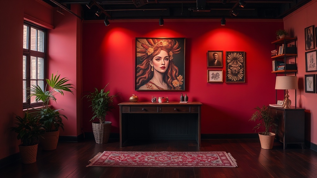
How Can Complementary Colors Create Contrast?
If analogous schemes are the quiet hum of a song, complementary schemes are the dramatic crescendo. Complementary colors are opposites on the color wheel—red and green, blue and orange, or yellow and purple. When placed next to each other, they create a high-energy vibration that makes the colors appear more vivid than they actually are. This is a powerful tool for making a focal point pop.
The trick with complementary colors is balance. If you use them in equal amounts (a 50/50 split), the visual tension might be too much, making the viewer feel slightly uncomfortable. Instead, try the 80/20 rule. Use a dominant color for the majority of your piece and a tiny bit of its complement to highlight a specific detail. This creates a sharp, intentional point of interest that draws the eye exactly where you want it to go.
"Color is a force than acts upon the human soul." — Wassily Kandinsky
(Note: While many artists follow this philosophy, your specific application depends on your unique visual voice.)
When you're mixing-on-the-palette, remember that complementary colors can also be used to desaturate or neutralize a color. If a certain orange feels too bright or "plastic," adding a tiny bit of its opposite, blue, will dull the vibrancy and create a more natural, earthy tone. This is a secret weapon for adding depth to a piece.
What Are Split-Complementary Palettes?
A split-complementary scheme is a variation of the standard complementary approach. Instead of picking the direct opposite of your base color, you pick the two colors adjacent to the opposite. For example, if your base is yellow, instead of just using violet, you might use blue-violet and red-violet. This provides much more variety and less "clashing" than a standard complementary pair.
This technique is perfect for artists who want high contrast but also want to maintain a sense of color harmony. It gives you a wider range of hues to play with while still keeping the underlying structure of the color wheel intact. It's a sophisticated way to build a palette that feels both dynamic and intentional.
Practical Application: Building a Color Map
Before you touch your canvas or paper, I recommend creating a color map or a swatch sheet. This is a way to organize your thoughts before the actual execution. List your primary color, your secondary supporting colors, and your neutrals. This prevents that moment of panic where you realize your palette doesn't actually work together.
- Step 1: Choose a dominant hue (the mood of your piece).
- Step 2:
Identify its neighbors for a soft, analogous look.- Step 3:
Identify its opposite for a high-contrast focal point.- Step 4:
Test your mixes on a scrap piece of paper to see how they dry.
For more technical details on pigment behavior, you can check out the resources at Britannica or explore the color systems used by professionals. Always remember that color behaves differently depending on the medium. Acrylics dry darker than they look wet, while watercolors rely on the white of the paper for their brightness. Understanding these physical properties is just as important as knowing the color wheel itself.
The goal isn't to follow these rules perfectly every time, but to understand them well enough that you know exactly when to break them. A well-executed "mistake" in color is often what makes a piece feel alive and spontaneous. Whether you're working with gouache, oil, or digital brushes, these relationships are the foundation of your visual language.