Organizing Your Sketchbook with Intentional Layouts and Visual Systems

You'll learn how to structure your sketchbook pages using grid systems, color coding, and layering techniques to turn random sketches into a cohesive visual record.
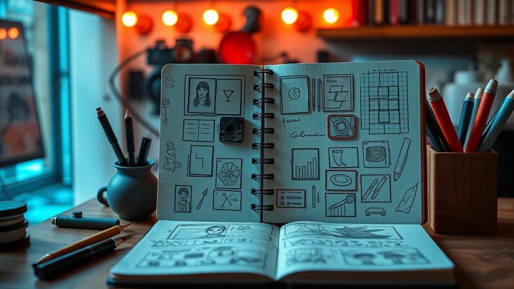
A sketchbook shouldn't just be a graveyard for half-finished ideas. Instead, it's a place where your creative impulses meet a bit of structural logic. When you approach a blank page, the fear of the empty space often leads to hesitation. By implementing specific layout systems—think of them as the scaffolding for your art—you can move from chaotic scribbles to a sophisticated visual journal that documents your growth. This isn't about making things perfect; it's about creating a system that allows your creativity to flow without getting lost in the mess.
Most artists struggle with the transition from a single drawing to a full-page composition. You might have a great sketch of a botanical element, but then you don't know what to do with the white space around it. This is where structural planning comes in. You can use subtle geometric shapes, varying line weights, or even a strict grid to dictate where your eyes move across the page. It's about intentionality. Whether you're using a dot grid or a blank page, having a mental map of your layout helps you decide where the focal point lives and where the secondary details live.
How do I create a balanced composition in a sketchbook?
Balance doesn't always mean symmetry. In fact, many of the most interesting layouts rely on asymmetrical balance. You might place a large, heavy element on the bottom left and balance it with several smaller, lighter elements on the top right. To achieve this, try the rule of thirds. Imagine your page is divided into a 3x3 grid. Placing your primary subject at one of the intersections rather than dead center creates a more dynamic and professional feel. This is a technique used heavily in classical fine arts and photography alike.
One way to manage this is by using a light pencil sketch to map out your "zones." Don't jump straight into ink or paint. Map out your boundaries first. Are you leaving room for a title? A date? A small block of text describing your process? By designating these zones early, you prevent the common mistake of running out of room for your most important elements. Think of your page as a piece of real estate—every inch should have a purpose, even if that purpose is just to provide breathing room (often called "negative space").
Can I use color to organize my different artistic-medium experiments?
Color is one of the most effective tools for organizing a messy sketchbook. If you're experimenting with different mediums—like watercolor one day and gouache the next—you can use a color-coded system to keep your progress clear. You might decide that every page featuring a watercolor study uses a specific color of way tape at the edge, or perhaps you use a specific color palette for your headers. This turns your sketchbook into a searchable visual library.
For a more integrated approach, try using color to create depth. Use muted or desaturated tones for background elements and save your most vibrant, saturated pigments for your main subject. This naturally guides the viewer's eye. If you're looking for more inspiration on color theory and how it impacts visual weight, the Adobe Color documentation is a wonderful resource for understanding how hues interact. By being intentional with your palette, you're not just decorating a page; you're directing the viewer's attention.
What are the best ways to document my progress over time?
A sketchbook is a living document of your evolution. To make it truly functional, you need a way to track your progress. I recommend adding a "key" or a small index at the beginning or end of your book. You can note the medium used, the date, and even the mood or intention behind the piece. This turns a collection of drawings into a structured archive of your creative life. If you're a fan of technical accuracy, you might enjoy looking at how artistic drawing principles are traditionally taught to build a foundation.
Consider adding a "process section" to your pages. Instead of just showing the finished piece, include a small corner for a color swatch, a test of a new brush stroke, or a tiny thumbnail sketch of your initial idea. This makes the sketchbook a teaching tool for your future self. When you look back in six months, you won't just see a pretty picture; you'll see the actual steps you took to get there. This level of detail is what separates a casual doodle book from a professional-grade visual journal.
Ultimately, the goal is to move away from the idea that an art journal is just a place for "bad" drawings. It is a laboratory. By using grids, color systems, and structured layouts, you're building a framework that supports your experimentation. You're giving your creativity a home that is both organized and expressive. Next time you open your book, don't just start drawing. Take a moment to plan the architecture of the page. Decide where the weight will lie, where the color will sing, and how you'll document the path.