Mastering Watercolor Washes: From Flat to Gradient Techniques

This post covers flat washes, graded washes, variegated washes, and wet-on-wet gradient techniques essential to watercolor painting. Understanding these foundational wash methods enables artists to create smooth backgrounds, atmospheric skies, and seamless color transitions that elevate bullet journal spreads, planner pages, and fine art pieces from amateur to professional quality. Whether working in a 5x7 inch Leuchtturm1917 notebook or on 11x14 inch Arches cold press paper, precise wash control remains the difference between muddy pools and luminous color fields.
The Anatomy of a Flat Wash
A flat wash produces an even, uniform layer of color without visible brushstrokes or value shifts. This technique serves as the foundation for planner layouts, habit tracker backgrounds, and solid color blocks in botanical illustrations.
Materials and Setup
For washes up to 8x10 inches, use a 1-inch Princeton Aqua Elite wash brush or a 3/4-inch Escoda Prado synthetic. The brush must hold sufficient water—a typical flat wash on 9x12 inch paper requires approximately 2-3 milliliters of pigment solution. Professional-grade paints such as Daniel Smith, Winsor & Newton Professional, or Schmincke Horadam provide better flow characteristics than student-grade alternatives.
Tape the paper to a rigid board at a 10-15 degree angle using drafting tape or washi tape. The slight tilt prevents water from pooling while allowing gravity to assist pigment flow. For bullet journal work on 120-160 gsm paper, apply no more than 1 milliliter of liquid to prevent buckling and bleed-through.
The Execution
Mix enough pigment to complete the wash in one continuous session—stopping mid-wash creates hard edges. Load the brush fully and draw a horizontal stroke across the top of the paper. Without lifting the brush, immediately draw a parallel stroke slightly overlapping the first. Continue this bead method, allowing excess liquid from the upper stroke to flow into the next. The working bead of liquid should remain visible at the bottom of each stroke.
For a 5x7 inch wash, complete the entire surface in 45-60 seconds. Slower application risks drying lines; faster work creates uneven coverage. Practice on Strathmore 400 Series watercolor paper (300 gsm, cold press) before attempting on premium Arches or Hahnemühle sheets.
Graded Washes: Value Transitions
Graded washes transition smoothly from dark to light, essential for creating depth in bullet journal monthly spreads, atmospheric perspective in landscape sketches, and dimension in floral studies. The technique requires controlling pigment concentration while maintaining consistent water flow.
Two-Brush Method
This reliable approach uses two brushes: one loaded with concentrated pigment, the other with clean water. Begin with the pigment brush, applying full-strength color at the top of the work area. Rinse and blot the second brush, then draw it along the bottom edge of the pigment stroke to soften the transition. Alternate between adding pigment and diluting with water, working downward.
A typical graded wash across 30 centimeters requires decreasing pigment concentration by approximately 15-20% per horizontal band. Daniel Hanson's studies demonstrate that most successful graded washes span 5-7 distinct value steps before reaching pure paper white.
Single-Brush Dilution Technique
With practice, the graded wash succeeds using one brush. Start with heavily concentrated pigment—roughly 1 part paint to 2 parts water for professional-grade colors, or 1:1 for student-grade paints. Apply the first horizontal stroke, then dip the brush in water without cleaning it completely. Apply the next stroke, repeating the dilution process until the wash reaches paper white.
This method demands speed. A 22x30 cm graded wash must complete within 90 seconds to prevent drying lines. Working on cold press paper extends the working time by 20-30 seconds compared to hot press due to increased surface texture and absorption.
Wet-on-Wet Gradient Techniques
Wet-on-wet painting deposits pigment onto damp paper, allowing colors to bleed and blend organically. This technique creates ethereal backgrounds for journal spreads, soft-focus effects in portrait studies, and natural-looking skies in travel sketches.
Controlled Wet-on-Wet
Apply clean water using a 2-inch hake brush or large wash brush. The paper should reach a consistent dampness—no standing water, but a visible sheen. Test by touching the corner; water should transfer slightly to a finger without dripping. This optimal saturation window lasts approximately 3-5 minutes in 70°F, 50% humidity conditions.
Drop pigment into the wet surface using a round brush size 6 or 8. Winsor & Newton Cotman brushes or Raphael Kaërell synthetic rounds work well. The pigment will spread to a predictable diameter: approximately 3-4 centimeters for heavily concentrated paint, 6-8 centimeters for light washes. Guide the flow by tilting the board or using a dry brush to absorb excess pigment.
Multiple Color Transitions
For variegated washes—multiple colors blending seamlessly—work quickly. Prepare three pigments in separate wells: for example, Daniel Smith Quinacridone Gold, French Ultramarine, and Quinacridone Rose. Apply the first color to the upper section, immediately add the second color overlapping by 1-2 centimeters, then the third. The wet surface facilitates natural blending at the intersections.
Limit the palette to 2-3 colors. Beyond three pigments, muddy browns and grays dominate. Maintain color temperature consistency: combine warm colors (yellows, oranges, warm reds) with other warms, or cool colors (blues, cool greens, purples) with cools. Crossing temperature boundaries requires a neutral transition color such as raw sienna or neutral tint.
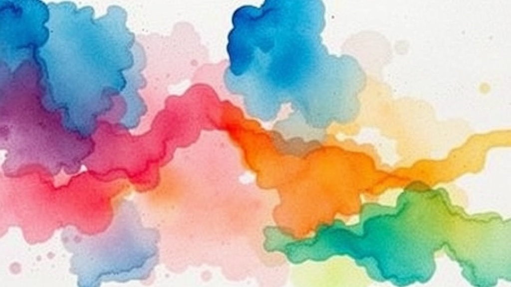
Variegated Washes for Visual Interest
Variegated washes incorporate two or more distinct colors that merge without mixing into mud. This technique appears in decorative bullet journal headers, artistic habit trackers, and expressive landscape backgrounds.
The Color Bridge Method
Select colors sharing a common pigment or adjacent on the color wheel. Cobalt Blue and Viridian Green both contain blue undertones; Quinacridone Gold and Burnt Sienna share warm orange bases. Apply the first color to one-third of the area, the second color to the opposite third, leaving the center section blank.
Using a clean, damp brush, draw horizontal strokes connecting the two colors. The moisture reactivates both pigments, creating a bridge zone where they intermingle. This transition area should span 2-3 centimeters for optimal visual harmony. The Loomis method, documented in Andrew Loomis's Creative Illustration, recommends maintaining a 60-30-10 distribution: 60% dominant color, 30% secondary, 10% transition zone.
Troubleshooting Common Issues
Blooming (Cauliflowering): Occurs when additional water or pigment contacts a drying wash. The additional moisture pushes existing pigment outward, creating blossom-like patterns. Prevention requires consistent timing—if a section has begun drying (matte appearance rather than sheen), do not add more liquid. Remedy by lifting the bloom with a damp brush and paper towel, then glazing over once dry.
Hard Edges: Unintended lines form when one section dries before adjacent areas merge. Maintain a consistent bead of liquid at the working edge. If a hard edge develops, soften immediately with a clean, damp brush using a horizontal pulling motion. For dried hard edges, sand gently with 600-grit sandpaper, or glaze over with matching color.
Backruns: Also called backwash, these occur when a wetter application meets a drier area. The wetter flow pushes into the dry zone, depositing pigment at the border. Control by monitoring paper saturation—if the paper absorbs liquid instantly without sheen, it is too dry for wet-on-wet work. For bullet journals with thinner paper (120-160 gsm), backruns prove particularly problematic; use minimal water and work in 2x2 inch sections maximum.
Practical Applications for Planners and Journals
Watercolor washes transform functional planning into visual art. Monthly cover pages benefit from flat washes in seasonal palettes: Naples Yellow and Sap Green for spring, Quinacridone Gold and Burnt Sienna for autumn. Weekly spreads utilize graded washes behind habit trackers, with value shifts indicating progress intensity.
For Hobonichi Cousin or Leuchtturm1917 Bullet Journal users, Tomo River paper (52 gsm) and Leuchtturm's 120 gsm pages respectively require modified approaches. These thin papers demand:
- Maximum 0.5 milliliters of liquid per square inch
- Light, single-pass application
- Immediate blotting with paper towel to prevent bleed-through
- Masking tape borders to prevent warping
Princeton Neptune series brushes, sizes 4-8, provide optimal control for small-format work. The synthetic squirrel hair holds sufficient pigment while releasing controlled amounts.
Advanced Wash Combinations
Professional watercolor work often layers multiple wash types. A typical landscape sequence might include:
- Flat wash for the foreground meadow (Sap Green, 1:3 pigment ratio)
- Wet-on-wet gradient for the sky (Cerulean Blue fading to paper white)
- Variegated wash for distant hills (Ultramarine and Violet, wet-on-dry)
- Glazed flat wash for shadows (Neutral Tint, 1:10 ratio, over dried layers)
Each layer must dry completely—typically 15-20 minutes in normal conditions, 30-45 minutes for heavy applications—before subsequent layers. A hair dryer on low heat accelerates this to 2-3 minutes, though natural drying produces more stable pigment adhesion.
Color Mixing for Specific Wash Effects
Standard watercolor palettes contain 12-24 colors, but strategic mixing expands possibilities. For bullet journal headers requiring high contrast against black ink:
- Deep Ocean: French Ultramarine + Phthalo Green (3:1 ratio)
- Desert Sunset: Quinacridone Rose + New Gamboge (2:1 ratio)
- Forest Canopy: Sap Green + Payne's Gray (4:1 ratio)
Test mixes on scrap paper identical to the final surface. Colors shift significantly between 90 lb student paper and 140 lb cotton rag. A mix appearing olive green on Strathmore paper reads as forest green on Arches.
"The wash is to watercolor what the chord is to music—fundamental, supportive, and capable of profound emotional resonance when executed with precision." — Jean Dobie, Making Color Sing
Watercolor mastery emerges through deliberate practice of these foundational techniques. Dedicate 20-30 minutes weekly to wash exercises: 4-inch flat washes, 6-inch graded transitions, and 3-color variegated blends. Document results in a dedicated technique journal, noting paper type, brush size, humidity levels, and drying times. Over 8-12 weeks, timing intuition and brush control develop to professional standards, enabling confident application in bullet journals, fine art pieces, and decorative crafts alike.