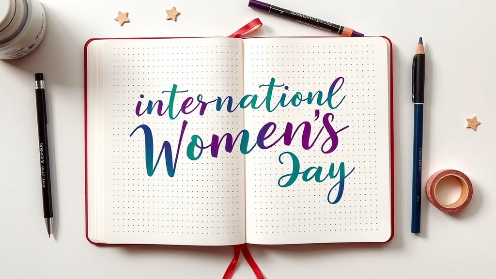
International Women's Day Typography: 4 Hand-Lettering Styles That Actually Look Good
March 8 is three days away and if you're anything like me, you're already thinking about what your IWD spread is going to look like. Not if you're going to make one — obviously you are — but how you want it to feel.
Here's the thing I've learned after doing this for a few years: the lettering is everything. It's what your eye hits first. A gorgeous spread with clunky headers will always feel off, and a simple spread with a really well-executed title will punch way above its weight. Today I want to skip the full spread layout talk and go straight to the four lettering styles I think work best for International Women's Day — why each one works, how to actually execute it, which pens to use, and the one mistake that kills each style.
These are techniques you can practice today. You don't need to have "good handwriting." You need a pencil, some construction lines, and about 20 minutes of messing around.
Why Lettering Is the Visual Anchor of Any Spread
Before we get into the styles: visual hierarchy. When someone looks at your spread, their eye moves in a predictable pattern — header first, then subheadings, then body text or trackers. The lettering in your header is setting the emotional tone for everything below it. It tells your brain: this is celebratory or this is formal or this is playful and warm.
"International Women's Day" has a lot of weight as a phrase. It can go in a lot of directions. These four styles each give it a different emotional register — and knowing which one resonates with you is half the work.
Style 1: Serif Elegance — For the "Timeless and Dignified" Vibe
The look: Classic Roman-inspired letterforms with deliberate thick/thin contrast. Feels like it belongs on a marble plaque or a vintage book cover. Dignified, intentional, serious without being cold.
Why it works for IWD: Women's contributions to history have often been deliberately minimized. This style reclaims formality. It says: this matters, and it always has.
How to build it:
- Lightly pencil two parallel baseline guidelines and two cap-height lines. Keep the lines close enough that your letters feel compact, not stretched.
- Sketch your letters in a neutral upright weight first — no thick/thin yet. Get the spacing right before anything else.
- Add thick strokes on the downstrokes only. Every time your pen would move downward to form a letter, that stroke is thick. Every upstroke and crossbar stays thin.
- Add serifs last — small horizontal feet at the base and top of each vertical stroke. They don't need to be perfectly symmetrical. Slight variation is handmade.
- Ink over your pencil, let it dry completely, then erase.
Best pens: A fine (.3mm or .4mm) fineliner for thin strokes and serifs, then a brush pen or a Pentel Sign Pen for your thick downstrokes. The contrast between the two tools is what makes this pop. Don't try to do thick/thin with a single variable-width pen when you're learning — use two separate pens.
Common mistake — uneven pressure trying to fake thick/thin with a brush pen. If you're using a Tombow dual-tip or a Pentel Fude Touch and pressing harder to get thick strokes, you'll get inconsistency. Go back to two pens. The fineliner controls your thin strokes, the brush controls your thick ones. Separate tools, predictable results.
Best for: Long headers where you want it to feel important. "International Women's Day" in serif elegance with deep purple ink on a cream page? Timeless.
Style 2: Modern Sans — For the "Clean and Contemporary" Vibe
The look: Geometric, uniform-weight letterforms with consistent spacing. No thick/thin contrast, no serifs, no frills. The visual equivalent of a deep breath.
Why it works for IWD: Modern sans has this calm authority to it. It's the look of contemporary feminist design — think magazine headers, protest poster type, brand identities for women-led organizations. It communicates: clear-eyed, current, no-nonsense.
How to build it:
- Draw a grid. Seriously. Four horizontal lines: baseline, cap-height, and two in between for a midline reference. Equally spaced.
- Work in pencil, keeping strokes as uniform in weight as possible. The challenge here is consistency, not flair.
- Letter spacing is your north star. Measure optically — letters that look evenly spaced, not letters that are mathematically evenly spaced (these are different things because of letter shapes).
- Round letters (O, C, G) need to extend slightly above and below your cap lines or they'll look small. This is called optical compensation and it's the difference between amateur and polished.
- Ink with a consistent-weight pen and erase.
Best pens: A Staedtler Triplus Fineliner 0.3mm or a Sakura Micron 0.5mm. Both lay down clean, even lines on Leuchtturm pages without bleeding in my testing.
Honest Leuchtturm note: On standard Leuchtturm dot-grid pages (80gsm), thin fineliners under 0.5mm have consistently performed well for me with no bleed-through — the Staedtler Triplus has been reliable across two years of regular use. Wide-tip markers are a different story: the Tombow dual-tip felt side has ghosted through on my Leuchtturm pages consistently enough that I treat it as expected behavior, not an exception. Your results may vary slightly depending on paper batch and humidity, but I'd test any new marker on a back page before committing to a spread.
Common mistake — inconsistent letter spacing. The two most common offenders: putting too much space between "I" and the next letter (because I is narrow and your brain doesn't know what to do with the gap), and cramming letters together at the end of a word because you misjudged the space. Solution: pencil your letters one at a time from the center of the word outward rather than left to right.
Style 3: Playful Script — For the "Celebratory and Warm" Vibe
The look: Flowing connected cursive with genuine personality. Letters with rhythm, some variation in size, slight forward lean. Feels like someone is genuinely happy while writing.
Why it works for IWD: Celebration deserves some joy in it. This is the style you use when you want the spread to feel like a party on paper, when you want to write the names of the women who inspire you in a way that feels like a love letter.
How to build it:
- Pencil a baseline only — don't constrain yourself with cap-height lines. Script breathes when it has vertical room.
- Practice the pressure map first, not the letters: in genuine brush-pen script, upstrokes are light (barely touching the page) and downstrokes are heavy (pressing into the page). Drill this. Up light, down heavy.
- Connect your letters through the baseline — the connection stroke exits one letter and enters the next without lifting.
- Let letters vary slightly in size. The variation isn't a mistake, it's the handmade quality.
- Add flourishes sparingly. One entrance flourish on the first capital. Maybe a small tail on the last letter. That's it. Every flourish after that is decoration eating into legibility.
Best pens: A Pentel Fude Touch Sign Pen for learners (very forgiving nib, consistent ink flow, cheap enough to use without anxiety). For more experienced scripts, a Tombow Fudenosuke soft tip gives you more expressive thick/thin range. Gel pens (Sakura Gelly Roll, Pilot G2) work for script but won't give you the thick/thin variation — use them when you want a consistent-width decorative script with no pressure work.
Common mistake — over-flourishing. I've done this. I still do this sometimes when I'm excited. You finish the word and it looks okay and you think: what if I added a little swoop there, and maybe a loop here, and— Stop. Flourishes should feel restrained. If you're adding them because you think the word needs to look "fancier," you're over-flourishing. Add one. Live with it for a minute. Decide if a second one is actually necessary or if you just want more. Usually: one is enough.
Style 4: Bold All-Caps — For the "Confident and Impactful" Vibe
The look: Heavy, tall block letters with clear weight and strong presence. Fills the horizontal space on the page. No subtlety — this is impact type.
Why it works for IWD: "INTERNATIONAL WOMEN'S DAY" in bold all-caps is a statement. It commands attention. Use this when you want the header to feel like a declaration, not a decoration.
How to build it:
- Plan your letter count before you put pen to paper. Count the letters, estimate the width of each character, figure out where your header starts and ends. All-caps headers that run off the page or look unbalanced look more amateurish than any other lettering mistake.
- Draw your guidelines: baseline and cap-height, close together. All-caps works best with letters that are slightly taller than they are wide.
- Pencil each letter with a hollow structure first — draw the outline of each character without filling it in.
- Proportion rule: keep letter widths consistent. O and D should be about 80% as wide as they are tall. I and L should be about 30%. Letters like M and W are wider, S and E are narrower. Eyeballing these proportions is the skill you're building.
- Letter spacing for impact type: when letters are bold and wide, give them air. Slightly more space between letters than feels natural. Compressed all-caps feels claustrophobic and amateurish.
- Fill in your letters, add a second outline stroke for even more weight if you want dimension, ink, erase.
Best pens: Paint markers (Posca or Molotow) for large block letters — they fill clean and dry fast. For medium-sized all-caps in a standard Leuchtturm spread, a Tombow dual-tip broad side or a Crayola Super Tip (genuinely — the Crayola is underrated for this) gives you good fill and edge control. Brush pens with a large tip (Kuretake No. 13, Pentel Aquash) also work if you're comfortable with them.
Common mistake — inconsistent sizing. One letter slips taller than the others, one sits below the baseline, and suddenly your bold statement looks anxious. The fix isn't more skill — it's more guidelines. Pencil your cap-height line dark enough that you can see it while you work. Adjust your letter height before you ink, not after.
Color Palettes for IWD
The traditional IWD palette is purple, white, and green — purple for dignity/justice, white for purity of purpose, green for hope. Established by the WSPU (Women's Social and Political Union) in 1908 and still in use today. You don't have to use it, but if you're going to use color symbolically, it's good to know the history.
Here are three palettes I'd reach for:
Palette 1: Jewel Tones (Bold, Celebratory)
- Deep Amethyst:
#6B3FA0 - Emerald:
#2D6A4F - Ivory White:
#F8F4E9 - Gold Accent:
#C9A84C
Best with: Serif Elegance or Bold All-Caps. This palette commands respect.
Palette 2: Soft Pastels (Warm, Affectionate)
- Dusty Lavender:
#B8A9C9 - Sage Mist:
#A8C5A0 - Blush:
#E8C5B0 - Warm White:
#FAF7F2
Best with: Playful Script or Modern Sans. This palette feels like a warm hug.
Palette 3: Monochromatic + Accent (Editorial, Focused)
- Deep Plum:
#4A1942 - Medium Mauve:
#8B5E83 - Soft Lilac:
#C9A9C5 - Champagne Accent:
#E8D5A3
Best with: Modern Sans or Bold All-Caps. This is the editorial choice — it looks intentional and cohesive.
The Pen Reference Table (Leuchtturm 80gsm, tested March 2026)
Prices are approximate US retail as of March 2026 — check your local art supply store or current online listings before budgeting, as stationery prices shift around.
| Pen | Approx. Price | Bleed on Leuchtturm | Best Style | Budget Alt |
|---|---|---|---|---|
| Staedtler Triplus Fineliner 0.3mm | ~$1–2/each | None in my testing | Modern Sans | Any Bic fineliner |
| Sakura Micron 0.5mm | ~$2–3/each | Minimal; ghost possible at 0.8mm+ | Modern Sans, Serif outlines | Staedtler Triplus |
| Tombow Fudenosuke Soft | ~$3–4 | Minimal on dry paper | Playful Script | Pentel Fude Touch |
| Pentel Fude Touch Sign Pen | ~$2–3 | None in my testing | Playful Script | Crayola thin marker |
| Tombow Dual Brush | ~$1–2/each | Ghosting on reverse side — consistent in my testing | Loose fills only | Crayola Super Tips |
| Posca PC-5M Paint Marker | ~$4–6 | None (sits on surface) | Bold All-Caps | Molotow ONE4ALL |
| Crayola Super Tips | ~$0.25–0.40/each | None in my testing | Bold All-Caps, fills | Use as-is |
| Pentel Aquash Brush | ~$5–7 | Minimal | Script, large fills | Pentel Fude Touch |
The honest budget verdict: A Crayola Super Tip, a Staedtler Triplus Fineliner, and a Pentel Fude Touch Sign Pen will cover all four styles — typically well under $10 at current retail combined. The premium pens give you more consistent ink flow and longer-lasting tips, but they are not magically going to make your letters better. Practice makes letters better.
The 2-Minute Rule That Changes Everything
Here's the callout I give everyone who says they "don't have time" to do nice lettering: the actual execution of a polished header takes about two minutes once you know your style. The learning phase takes longer. But once you've practiced a style even five or six times, you can pencil and ink a beautiful "International Women's Day" header in the time it takes your tea to steep.
The practice isn't wasted time. It's the technique paying for itself, every spread you'll ever make.
Go Make Something Imperfect Today
Pick one style from this list and try it tonight. Not on your good journal — on a piece of printer paper or a random notebook. Write "International Women's Day" in that style three times. Notice what's awkward, what's working, what you want to adjust. Then do it in your journal.
The goal isn't a perfect header. The goal is a header that looks like you made it intentionally. Those are very different things. A slightly wobbly serif with beautiful ink color and a thoughtful palette will always, always beat a technically perfect but lifeless template.
Your handwriting is your handwriting. Let it show.
Happy planning — and happy International Women's Day early. Go make something beautiful for the women in your life.
— Lina