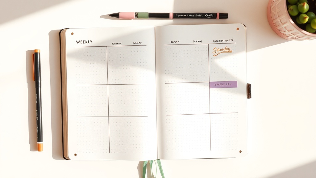
How to Color-Code Your Weekly Spread (Without the Chaos)

Okay okay okay if your weekly spread keeps turning into a chaotic rainbow and then you avoid looking at it by Wednesday... we need to fix that.
I know color-coding sounds simple, but most of us start with "I’ll use all my markers!" and end with visual overload. Too many colors = your brain has to re-decide what everything means every time you open the page.
This is the system that changed everything for me: 3 colors, 3 life categories, used the same way every week.
It keeps your spread calm, pretty, and actually functional.
The 3-color rule (and why it works)
Here’s the core idea: your colors are not decoration first. They’re labels.
My weekly system:
- Sage green = Work/Admin (meetings, deadlines, bills, errands)
- Muted gold = Personal/Social (friends, family, events, life admin that feels human)
- Dusty lavender = Health/Self-Care (movement, meals, sleep goals, reset time)
Why this works for planner organization:
- Your eye learns the pattern fast.
- You can scan your week in 3 seconds and spot imbalance.
- The page stays visually calm because pastel tones don’t scream at each other.
If everything is urgent red, neon yellow, bright blue, hot pink, and orange, nothing is actually clear.
Supplies I’m using (plus budget swaps)
These are the tools I actually recommend for this look.
Main setup
- Zebra Mildliner 5-packs for category highlighting and subtle coding
- Price check (Mar 5, 2026): about $7.00-$8.50 at JetPens for many 5-color sets; around $7.54 for a 5-pack listing at Walmart.
- Tombow Dual Brush Pens for headers/subheaders
- Price check (Mar 5, 2026): Tombow 10-packs are commonly around $20.69-$23.98 on Walmart listings depending on set/seller.
- Palette planning: Tombow’s official 108-color chart is great for choosing matching header shades before you ink the page.
- Recollections washi tape (Michaels house brand) as a light accent only
- Price check (Mar 5, 2026): many Recollections washi sets/tubes sold by Michaels show around $23.98 online; smaller themed sets can be lower.
Budget alternatives (under ~$5)
- Crayola Super Tips 20ct: about $5.49 at Target (recent listing)
- Mondo Llama 20ct washable markers: $4.00 at Target
- Any black gel pen + one ruler + one highlighter you already own
Budget or bougie, both are valid. The system matters more than the brand.
Step-by-step: set up color coding without clutter
1) Build a tiny color key first
Before you draw anything fancy, make a mini key in the top corner or margin:
- Green dot: Work/Admin
- Gold dot: Personal/Social
- Lavender dot: Health/Self-Care
That key prevents "wait what did yellow mean again?" all week.
2) Keep your base layout neutral
Draw your weekly boxes/columns in black or gray pen only.
Don’t color the whole spread yet. This is where people overdo it and lose readability.
3) Color only three elements
This is the anti-chaos move.
Use your category colors only on:
- Headers (small stroke or underline)
- Time blocks (light strip, not full-box fill)
- Task bullets/check marks
Leave everything else neutral.
4) Use the 70/20/10 balance
If your page feels busy, use this ratio:
- 70% neutral (black text + white space)
- 20% category color (functional coding)
- 10% decorative accent (washi/sticker)
I know it looks minimal at first, but hear me out: this gives your brain room to process.
5) Add washi like a divider, not confetti
Use one strip of washi in one place:
- Top header edge
- Mid-page split between weekdays/weekend
- Side margin to frame a notes column
That’s it. Washi should support structure, not fight your task text.
6) Do a 10-second visual audit
Before you close your planner, ask:
- Is one category swallowing the whole week?
- Did I leave space for self-care color blocks?
- Can I scan this page without squinting?
If yes, you nailed it.
A real example week (so you can copy/paste this)
- Sage green (Work/Admin): Monday team sync, invoice due, project draft
- Muted gold (Personal/Social): dinner with Ana, call mamá, Saturday birthday brunch
- Dusty lavender (Health/Self-Care): Pilates, grocery prep, Sunday no-plans reset block
This spread helps me avoid the classic problem where work tasks fill every inch and "take care of myself" never makes it onto paper.
I know it’s "just a planner," but this system gives me planner peace fast.
Common color-coding mistakes (and quick fixes)
- Mistake: Using a new color every week
- Fix: Keep the same 3 categories for at least one month.
- Mistake: Full-box highlighting
- Fix: Use slim bars/underlines instead so text stays readable.
- Mistake: Decoration before structure
- Fix: Fill tasks first, decorate second.
- Mistake: No self-care category
- Fix: Give self-care its own color so rest is visible and scheduled.
Spring refresh tip
If your January planner system feels rigid right now, this is your spring reset: keep your layout, refresh your palette, reduce your colors.
Same structure, calmer energy.
And if you shop Michaels for washi, check your Rewards/coupon section before checkout because their offers rotate.
Show me YOUR spread of the week. Are you team 3-color calm or team rainbow chaos recovery?