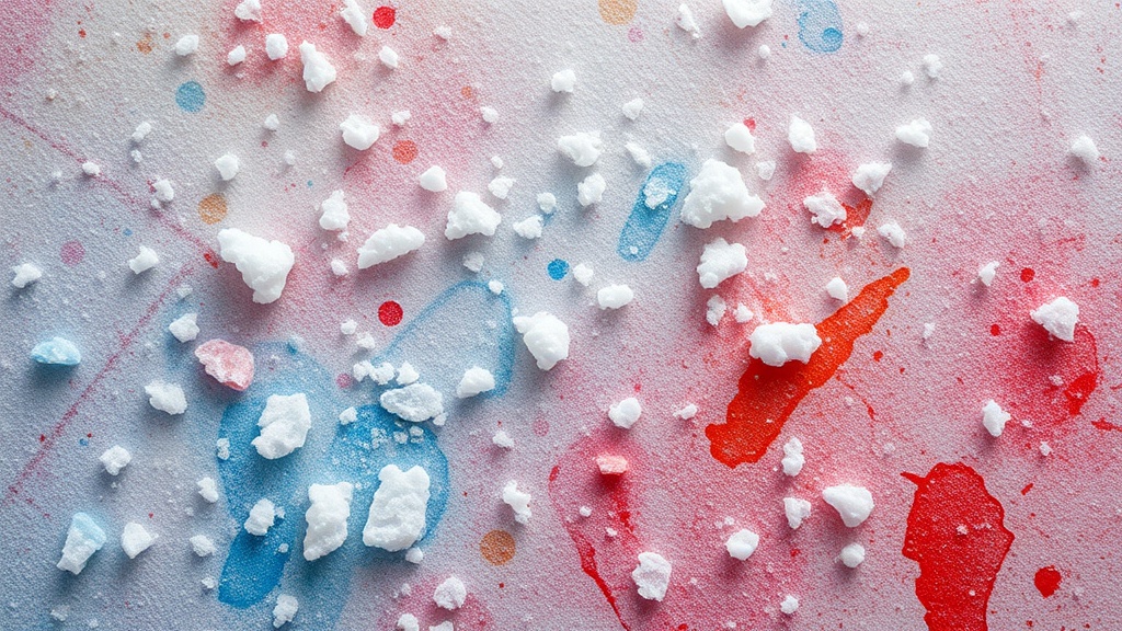
Building Texture with Watercolor and Salt

Imagine a single drop of deep indigo pigment hitting a wet sheet of heavy-weight paper. Before you even reach for a brush to spread it, you sprinkle a pinch of coarse sea salt over the surface. Within minutes, the salt begins to pull the pigment inward, creating tiny, crystalline-like blooms that look like distant galaxies or weathered stone. This isn't an accident; it's a deliberate way to add organic, tactile depth to a flat wash of color. Using salt is a way to move beyond smooth gradients and introduce a sense of physical presence to your visual art.
This technique works because of a simple physical reaction: salt is hygroscopic. It attracts and absorbs moisture. When you drop salt into a wet watercolor wash, it sucks up the water and the pigment, leaving behind these concentrated, textured spots that dry into beautiful, irregular patterns. It's a perfect way to break up the "too perfect" look that sometimes plagues beginner paintings. Whether you're working on a botanical study or a moody abstract piece, adding these textural elements makes the work feel more alive.
What type of salt works best for watercolor?
You don't need fancy art supplies to get this effect, but the size of the grain matters for the final look. If you use fine table salt, the effect will be subtle and almost invisible once dry. If you use coarse sea salt, you'll get much more dramatic, high-contrast blooms. For the best results, I recommend using kosher salt or even rock salt. The larger the crystals, the more significant the "bloom" will be. It's helpful to remember that the salt is a temporary tool—it's there to create the pattern, not to stay in the painting as a physical grain. Once the paint is bone-dry, you'll brush the salt away to reveal the pigment-rich shapes underneath.
"The magic happens in the drying process. You have to be willing to let the material do the work for you."
One thing to watch out for is the timing. If the paper is too wet, the salt might sink too deep and create large, messy blotches. If the paint is already starting to dry, the salt won't have enough moisture to grab, and you'll end up with nothing. You want that "sweet spot" where the paint is still glistening and highly mobile on the page.
How do I prevent salt from ruining my painting?
A common fear is that the salt will leave a permanent, crusty texture. To avoid this, ensure you are using high-quality, 100% cotton paper. Papers with high wood pulp content tend to warp or pill more easily when subjected to the intense moisture absorption of salt. For more technical details on paper weight and how it handles water-heavy techniques, you can check out the resources at Winsor & Newton. Using a heavy-weight paper (at least 300gsm) provides the structural integrity needed to handle the wet-on-wet stage without buckling.
Another way to control the outcome is to apply the salt in stages. Instead of dumping a pile, try scattering a few grains here and there. This prevents the salt from creating a massive, singular void in your color field. If you're working on a large-scale piece, you might even want to test a small section of your paper first. This way, you'll see exactly how much pigment the salt pulls from your specific brand of paint. It's a way to experiment without the pressure of a finished piece.
Can I use other materials to create texture?
Salt isn't your only option for adding grit or organic shapes to a watercolor wash. You can also use baking soda for a more granular, grainy texture, or even a tiny bit of coarse sand if you want something much more aggressive. If you want a more controlled, circular bloom, try a drop of rubbing alcohol. Alcohol pushes the pigment away rapidly, creating a different kind of organic shape that looks much more like cellular structures. For those interested in the chemical properties of pigments and mediums, the Daniel Smith website offers great insights into how different materials interact.
Here is a quick guide to common additives and their effects:
| Material | Effect on Pigment | Visual Result |
|---|---|---|
| Fine Salt | Subtle absorption | Soft, light speckles |
| Coarse Sea Salt | Strong absorption | Defined, dramatic blooms |
| Baking Soda | Granular texture | Tiny, matte-like dots |
| Rubbing Alcohol | Rapid displacement | Cellular, circular voids |
As you refine your practice, you'll find that these "controlled accidents" are what give your art its soul. Don't be afraid to get a little messy. The goal isn't to have a perfectly smooth gradient—it's to create something that feels tactile and deep. When you look at your finished work, you want to see layers of texture that suggest a world beyond the surface of the paper. This is where the planning meets the intuition. You plan the color, you plan the layout, but you leave room for the salt to tell its own story.