5 Creative Techniques to Transform Your Art Journal from Blank to Beautiful

Layered Collage with Vintage Papers
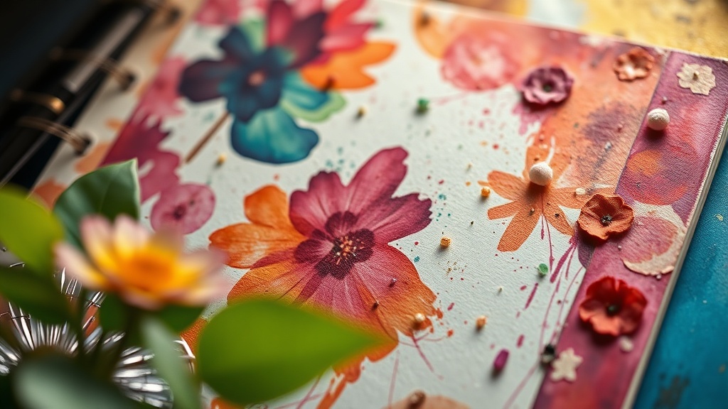
Watercolor Wash Backgrounds
Texture Building with Modeling Paste
Hand-Lettered Quote Integration
Stamping and Stencil Patterns
An art journal sits on the shelf. Blank pages stare back. That beautiful leather-bound book—maybe a Moleskine Art Collection or a hand-picked notebook from a local art supply store—deserves more than empty promises. This post covers five creative techniques that transform those intimidating white pages into visual stories you'll actually want to revisit. Whether you're a seasoned bullet journaler looking to add artistic flair or a complete beginner wondering where to start, these methods work without requiring an art degree.
What Are the Best Art Journaling Techniques for Beginners?
The best art journaling techniques for beginners focus on low-pressure, high-reward methods: collage, watercolor washes, washi tape borders, stamp impressions, and simple line drawings. These approaches require minimal supplies and forgiving skill levels.
Here's the thing—perfectionism kills creativity. (Ask any artist who's stared at a blank page for twenty minutes, too afraid to make the first mark.) The goal isn't gallery-worthy art. The goal is expression. Documentation. A place where lists meet color.
Start with collage. Old magazines, ticket stubs, botanical prints torn from discarded books—layer these fragments with glue stick or matte medium. The Mod Podge Matte formula works beautifully for this, drying clear without that plastic shine that screams "craft project gone wrong."
Washi tape offers another forgiving entry point. These Japanese paper tapes peel off cleanly when you change your mind (and you will). Create borders, frame quotes, or section off weekly spreads. Brands like MT Masking Tape offer patterns ranging from minimalist grids to bold florals. The MT Casa line even comes in wider widths perfect for background coverage.
Watercolor washes intimidate some beginners, but they're actually quite forgiving. Load a brush with pigment. Drag it across the page. Let colors bleed into each other while you sip coffee. The page doesn't need to look like anything specific—not yet. You're just creating atmosphere. A backdrop for words.
How Can You Mix Writing and Visual Art in a Journal?
You mix writing and visual art by treating words as design elements rather than afterthoughts—vary lettering styles, incorporate handwriting into compositions, and let imagery inspire text placement. The journal becomes a conversation between what you see and what you think.
The catch? Most people treat writing and art as separate columns. Monday: to-do list. Tuesday: attempted watercolor. Wednesday: back to boring bullet points. That's not an art journal. That's a planner with occasional decoration.
Instead, integrate. Write over painted backgrounds. Draw borders around important notes. Use lettering variations to create visual hierarchy—block letters for headers, cursive for reflections, tiny print for details. The Tombow Dual Brush Pens excel here, offering both fine tips for writing and brush ends for decorative flourishes.
Consider the "visual list" approach. Rather than writing "groceries: milk, eggs, bread," sketch simple icons. A milk carton. An egg carton. A baguette. Takes longer? Absolutely. But you'll remember that list. You'll smile at that list. And isn't that the point of a creative practice?
Some journalers dedicate specific spreads to "word art"—quotes rendered in decorative scripts, song lyrics flowing around watercolor splashes, or poetry emerging from painted landscapes. Others prefer subtle integration: small illustrations tucked beside meeting notes, color-coded headers, marginalia that grows into full-page drawings. Both approaches work. The key is intentionality.
Comparing Mixed Media Approaches
| Technique | Best For | Skill Level | Dry Time |
|---|---|---|---|
| Collage layering | Quick backgrounds, texture building | Beginner | 15-30 minutes |
| Watercolor washes | Mood setting, color themes | Beginner-Intermediate | 1-2 hours |
| Acrylic paint pens | Bold accents, opaque coverage | Intermediate | 5-10 minutes |
| Stamp impressions | Consistent motifs, repetition | Beginner | Immediate |
| Hand-lettering | Headers, quotes, emphasis | Intermediate-Advanced | Immediate |
Worth noting: acrylic paint pens (like Posca markers) solve a common journaling frustration. They cover dark backgrounds. They write on washi tape. They transform mistakes into intentional-looking splatters. Keep a white PC-5M nearby for corrections that look like art.
What Supplies Do You Actually Need for Art Journaling?
You need surprisingly few supplies to start art journaling: a quality sketchbook with paper that handles wet media, a reliable black pen, and one coloring medium of choice (watercolors, colored pencils, or markers). Everything else is optional enhancement.
The art supply industry wants you to believe otherwise. (Those perfectly arranged Instagram flat-lays with forty-seven coordinated pens? Marketing.) Start small. Build slowly. Curate tools that actually get used.
For sketchbooks, paper weight matters. Look for 140lb (300gsm) or heavier if you plan to use wet media. The Strathmore 400 Series Visual Journals offer mixed media paper at accessible price points. For premium options, Stillman & Birn's Beta series handles everything from fountain pens to heavy acrylic.
Black pens form the backbone of most journal work. Test candidates on your specific paper—some bleed, some feather, some dry instantly while others smudge for minutes. The Uni-ball Signo UM-151 and Sakura Pigma Micron remain industry favorites for good reason. They're consistent. They're archival. They don't give up halfway through a detailed border.
Choose one coloring medium to master before expanding:
- Watercolors: Portable, blendable, unpredictable (in the best way). The Koi Water Colors pocket field sketch box travels anywhere.
- Colored pencils: Precise, layered, meditative. Prismacolor Premier offers creamy pigment that actually deposits on paper (unlike those bargain sets from childhood).
- Markers: Bold, immediate, graphic. Copic Ciao markers provide professional quality without the full Copic Sketch price tag.
That said, limitations spark creativity. Try completing ten spreads with just one pen and one highlighter. Constraints force innovation. They reveal that the artist—not the tool—creates meaning.
How Do You Overcome the Fear of Ruining a Blank Page?
You overcome blank page fear by giving yourself permission to create "ugly" pages, starting with non-precious materials, and remembering that finished matters more than perfect. The first mark breaks the spell.
That pristine white spread? It's not sacred. It's paper. Expensive paper, maybe— bound in leather, purchased with intention—but still just paper. It wants your coffee rings. Your misspelled words. Your "what was I thinking?" color combinations.
Practical strategies help:
- Start in the middle. Open to any random page. Not page one. Never page one. That's where expectations live.
- Create a "wreck this page" spread. Deliberately messy. Paint spilled intentionally. Words crossed out. This permission slip reminds you that control isn't the goal.
- Use pencil first. Erasable lines lower stakes. (Though many journalers eventually abandon pencil—trusting the permanent mark builds confidence.)
- Work in themes across multiple pages. One failed attempt becomes part of a series. Context forgives imperfection.
The bullet journaling community understands this paradox deeply. A planner must function. It must hold information. But it also deserves beauty—even messy, experimental, "let's see if this works" beauty. The official Bullet Journal method emphasizes rapid logging for this reason: capture first, decorate second, reflect always.
"The only way to do bad art is to not do art at all." — This mantra appears frequently in creative communities, attributed to various teachers. The sentiment matters more than the source.
What Are Some Weekly Art Journal Themes to Try?
Weekly art journal themes include color studies, gratitude collections, daily observations, material experiments, and mood documentation—each providing structure that eliminates the "what should I create?" paralysis.
Structure liberates. (Sounds contradictory, but ask any creative who stares at infinite possibilities.) A weekly theme narrows focus without limiting expression. It creates cohesion across seven days of scattered moments.
Try these approaches:
Color of the Week: Pick one hue. Explore its variations, its associations, its emotional weight. Blue week might include navy watercolor washes, cyan marker notes, a pressed blue hydrangea, quotes about sadness or sky. The constraint sparks observation—you'll start noticing blue everywhere.
Texture Inventory: Collect rubbings from interesting surfaces (coins, tree bark, grates). Layer them with translucent paint. Document where each texture came from. The journal becomes a tactile memory palace.
Micro-Season: Rather than "fall," focus on "early October light" or "the week the oaks turned." Specificity breeds poetry. The Japanese concept of komorebi—sunlight filtering through leaves—deserves its own spread.
Material Monday through Sunday: Dedicate each day to a different supply. Monday: only ink. Tuesday: only collage. Wednesday: only pencil. By Sunday, you'll understand your tools better and probably discover unexpected combinations.
The best themes connect to real life. A stressful week might need calming blue-green spreads. A travel week demands ephemera collection—receipts, maps, snippets of conversation. Let circumstances guide the aesthetic, not the other way around.
Artsy Agenda exists because organized living and creative expression aren't opposites. They're partners. The bullet journaler who color-codes appointments also doodles in margins. The watercolor enthusiast tracks paint swatches with systematic precision. These practices share DNA: attention, intention, and the radical act of giving time to beauty.
Pick up that blank journal. Make one mark. Then another. The transformation from empty to overflowing happens one page at a time—no art degree required, no permission slip needed, no summary necessary.